Designing custom nonprofit merchandise like t-shirts, sweatshirts, tote bags, and other apparel and accessories does more than just generate fundraising revenue. Supporters will likely continue to wear or use the merch for years after their purchase, amplifying your mission, boosting brand recognition, and strengthening the sense of unity among supporters.
But to take advantage of these benefits, you need to create compelling designs that supporters want to buy and wear. This means implementing thoughtful design choices that balance branding, wearability, and nonprofit storytelling. In this guide, we’ll explore the five most impactful design elements to include in your nonprofit merch.
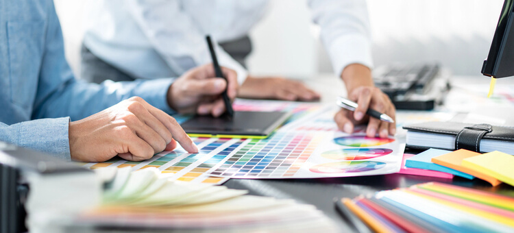
1. Color
Color is often the first thing people notice in a design, so it plays a major role in how your merch is perceived. Colors can hold widely understood symbolic meanings. For instance, a study on color psychology found that 68% of respondents associated red with love and 52% felt that yellow communicated joy.
Browse these colors and their associated causes to get inspired:
- Blue: Represents trust and credibility, used for causes related to healthcare, education, and financial support.
- Red: Symbolizes urgency, passion, and action, often used for causes like disaster relief and emergency fundraising.
- Yellow: Communicates optimism and energy, used for youth programs, community initiatives, and awareness campaigns.
- Green: Represents nature and growth, typically used for environmental or conservation causes as well as health campaigns.
- Orange: Communicates a sense of warmth and enthusiasm, commonly used for causes like youth outreach or mental health support.
- Purple: Embodies creativity, compassion, and wisdom, used by causes related to human rights, arts organizations, and advocacy.
- Pink: Symbolizes compassion, empathy, and empowerment, and is often associated with female-led initiatives and women’s health awareness or causes.
Alternatively, you can choose to use your nonprofit’s brand colors on the shirt—the key is consistency. For example, if your annual charity race has its own branding, be sure to use those colors in your merch design, event signage, and any marketing related to the campaign.
2. Typography
Typography, which involves making written content both readable and visually appealing, also plays an important but often underappreciated role in design. The typefaces you choose influence readability and style, communicating the emotion behind your mission or campaign.
Here are the most important considerations to keep in mind:
- Choosing the right typeface. You’ll need to choose a typeface that accurately reflects your nonprofit’s voice. For more serious causes, like cancer awareness, you might choose simple, clean fonts, while a black cat rescue group might opt for something more whimsical. Above all, make sure the font is easy to read.
- Visual hierarchy. Guide readers’ eyes by arranging text in order of importance. Typically, viewers will notice the largest, boldest text first, so you might use large lettering in a color that contrasts with the background for the name of the event or campaign. Less important information can use smaller text, less contrast, and less saturated colors.
- Clarity and simplicity. Avoid having too many colors or fonts in your design—if everything is busy and contrasted, no one element will stand out. Stick to two to four colors and no more than two fonts (e.g., a display font for titles and a simple sans serif font for body copy).
Additionally, don’t add too much text to the design in general, particularly for the shirt’s “headline.” Because the text will be printed on apparel, you’ll want to ensure people can read and understand it at a glance. Aim for strong, punchy slogans that are around five to seven words.
3. Imagery & Icons
If you find yourself struggling to communicate your entire mission in just a few words, you’re not alone. However, using symbols, graphics, and other iconography can communicate your mission instantly, without driving up the word count. Strengthen your designs by:
- Incorporating your nonprofit’s logo to strengthen brand recall. Getting Attention recommends that your logo emulate and illustrate your mission, use colors with the right emotional connotations, use readable fonts, and maintain a simple and timeless design.
- Using recognizable symbols related to your cause. This could include hearts, joined hands, animals, or nature motifs.
- Creating custom illustrations or icons when possible to make your designs feel more personal, unique, and authentic to your organization.
- Balancing text and imagery so neither overwhelms the other. Again, consider visual weight and hierarchy here, and ensure there is ample negative space in the design so your merch doesn’t appear busy or crowded.
The classic saying that a picture is worth a thousand words can ring true here. Use powerful visuals combined with color and typography to tell your nonprofit’s story and inspire support.
4. Layout & Placement
Where you place your design elements is just as important as what they are. On t-shirts, text and icons are often on the front center, pocket area, back of the shirt, or sleeve. Consider these common placements to maximize readability and visual impact:
- Front center: Add your logo, a symbol that represents the cause, and the campaign name or slogan.
- Pocket area: Leverage more stripped-back elements here, such as a simplified version of your logo, relevant acronyms, or a symbol.
- Back: Place campaign or event sponsor logos, campaign hashtags, or QR codes where viewers can find more information, and even participant or team names (e.g., recognize your volunteer leaders).
- Sleeve: Include short, impactful messages or symbols, titles (e.g., “Volunteer” or “Team Lead”), secondary branding or partner logos, or the year the event is taking place.
Don’t aim to fill every space on the shirt—overcrowding will make your overall design less effective. Determine which information is most important to include, then select the most logical placements from there.
5. Overall Wearability
Even the most thoughtful design won’t get worn if it doesn’t appeal to your supporters’ preferences. But creating merch that supporters want to wear hinges on understanding who your audience is and what they want or need from your products. To do so, we recommend asking yourself the following questions:
- Who do you hope will buy your custom merch?
- Where and how do you typically interact with this audience?
- What does your audience value about you and your work?
- What other common interests or values do your audience members hold?
- Are there any running motifs, jokes, or catchphrases your audience loves and would enjoy seeing featured on your merch?
Use the answers to these questions to guide your design decisions—for instance, if your organization has a mascot that’s popular with supporters, you’ll likely want to include it somewhere on the shirt. Keep practicality in mind, too, especially when selecting the merch style. Sweatshirts or long-sleeved shirts might be a big hit at a chilly fall festival, while charity 5K participants will likely prefer tank tops.
Designing custom merch doesn’t have to be difficult or stressful. There’s a science to the creative process, and considering the core design elements discussed in this guide will ensure your merch is visually polished and appealing to supporters. Whether you’re selling t-shirts to raise money or offering branded totes as a thank-you gift to donors, custom merch succeeds when it combines thoughtful design with a meaningful representation of your mission.