Your nonprofit’s website is undoubtedly one of your most important assets right now and has hopefully played a pivotal role in helping you navigate the challenges of recent months.
But the need for a high-performing website is only growing as donors become fully accustomed to engaging with their favorite missions through online-only channels. This means that reducing friction or slowdowns on your website is more critical than ever, especially during the year-end giving season. Donors expect and deserve seamless experiences on your website.
A frictionless and intuitive website isn’t just good for your donor relations, it’s also increasingly important for your bottomline.
Donation conversions occur when visitors to your donation page complete a transaction. When your website offers a clunky, slow, or confusing experience, you’ll see significant drops in conversions, resulting in less online revenue for your mission.
In 2019, only .17% of organic visitors to nonprofit websites made donations. These are visitors who arrive on your website on their own by searching for relevant terms on search engines and who often have no prior connection to your nonprofit. When your website has a difficult time converting new organic visitors into donors, that’s a definite sign to look for potential web design improvements.
At Cornershop Creative, we’re experts in nonprofit web design and development, so we know the difference that smarter design can have on conversion rates. Here are our top three tips for tweaking your donation page to convert more donors:
While you might need the support of specialized nonprofit consultants and designers for some deeper technical fixes, these suggestions are easy to begin implementing on your own. Remember, growing your conversion rates among all website visitors will be essential to keep raising more online in 2021, regardless of any new challenges thrown our way. Let’s dive in.
1. Streamlined design and UX
User experience (UX) refers to the quality of the entire experience that users on your website have as they progress towards completing a target action, in this case, making a donation. Design plays a critical role in creating positive, intuitive UX that encourages more donors to see the donation process through to the end.
Think of it this way: The donation process is the last and most important touchpoint between your nonprofit and a potential donor. Nothing should slow them down, frustrate them, or otherwise cause them to get distracted or give up on the process. Otherwise, your conversion rate will suffer, and you’ll miss out on valuable online support.
Web design can and should play an active part in minimizing these risks on your donation page. Make streamlined UX a top priority by following these best practices:
- Clean, branded, motivating design. Keep the visual design of your donation page simple, without any unnecessary elements. The form itself, some text explaining the impact of donations, your logo, and a compelling image of your mission in action are all you need to keep donors motivated and moving through the process quickly.
- Minimal required fields. Donation forms are a great place to learn more about your donors, but don’t ask for so much information that visitors are deterred from completing their transactions! Keep the number of required fields to a minimum, focusing only on the essentials. You can always ask for more information later as you continue building your relationships with new donors.
- Single-page or multiple stages with clear labels. You can offer a lightning-fast donation process by keeping it to a single form that donors fill out. If you find that your form becomes too long or that you need more information from donors, you might also consider breaking it up into a few separate stages, like for contact, billing, and amount information. If your donation process spans multiple stages, make sure to clearly label them and show donors exactly where they are in the process.
- Convenient, embedded placement. Your donation form should ideally be embedded on a page on your website, not housed on a separate, third-party platform that will require users to navigate away from your site. This will keep the process more seamless and ensure donors are confident they’re in the right place.
Take a note from some of Cornershop Creative’s favorite nonprofit sites. Here’s an example of a donation page that makes great use of all of the best practices listed above:
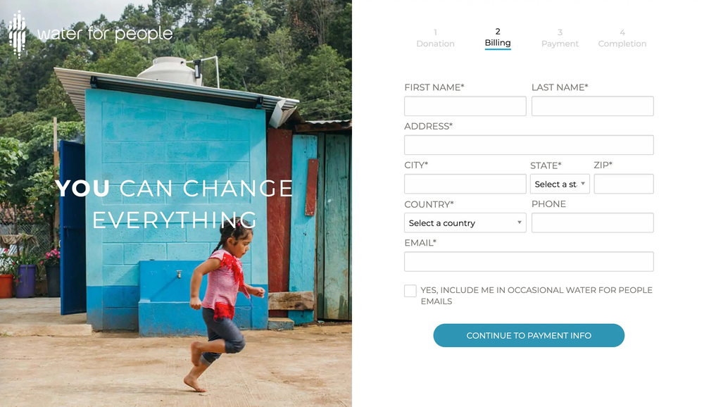
This donation page from Water for People includes short, impactful text, a vibrant image, their logo, and clearly labeled fields. Note how the four stages of the process are clearly labeled at the top. All of these elements come together for a streamlined page that drives conversions.
2. Concrete CTA Strategies
Calls-to-action (CTAs) are any elements of your website that direct users to take a specific action, like making a donation. Don’t take a loose approach to CTAs or assume that users will navigate to your donation page by themselves when they feel inspired to give. Actively direct them where you want them to go! This is the easiest and most direct way to boost conversions.
Clear CTAs can help you accomplish your goals in a number of ways, both in terms of driving donation conversions and boosting post-donation engagement:
- Driving donation conversions. Include a bold “Donate Now” button on your website’s header that links users directly to your donation page. This will ensure that no matter why a user came to your site, they’ll be able to easily jump over to make a donation. Additionally, think about your donation CTAs on off-site marketing materials or other engagement outlets. Your social media posts and livestream video platform should include clear buttons or links back to your donation page so that users have a direct path to give regardless of where they’ve encountered your message.
- Driving post-donation engagement. Have a concrete plan for how you’ll keep supporters engaged after they’ve made a donation. Specifically define what you want them to do after giving, like signing up for your email newsletter, following you on social media, or checking their matching gift eligibility. In the confirmation or thank-you message that displays after a completed donation, direct users to this predefined next action. This will help you make the most of the conversions you secure as you continue optimizing your donation process for user experience.
Without concrete CTA strategies across your website and other marketing outlets, it’s difficult to take a focused, strategic approach to improving your tactics over time.
Additionally, remember to periodically review your CTAs to ensure they’re still aligned with your current goals and the links are still directing users to live pages. This is a critical but often overlooked part of maintaining your website and keeping up conversions from one campaign or season to the next.
3. Suggested Donation Amounts
Suggesting donation amounts on your donation page can help to drive more conversions and generate more online revenue for your mission. By offering quick suggestions for donors to consider, you take the guesswork out of the process, reducing one more hurdle and boosting the chances that more visitors will successfully follow through with the process.
You’ll just need to design your tiers of suggested amounts in a way that actively encourages more conversions rather than deterring potential donors with amounts that are too high or too low. Follow these steps:
- Determine your average online donation amount. For your general donation page, study the data in your CRM to find the average amount that donors choose to give. For campaign-specific donation pages, you’ll also want to take that campaign’s revenue goals into consideration.
- Design tiers based on this average donation amount or target amount. Let’s say your average amount is $25. Here’s how your tiers might break down:
- One tier slightly below the average: $20
- One tier just above the average to encourage visitors to give a bit more: $30
- One or more tiers even higher, but still reasonable based on your historical online donation data: $50 and $100
- On your donation page, label the base or starting amount as your average to create a slight “peer pressure” effect. Communicate the specific impact of each giving level when possible, too. For instance, “A gift of $50 will buy meals for X families this winter.”
Offering suggested giving amounts directly on your donation page provides donors a more seamless process and helps you raise more. Well-designed giving tiers should boost your conversions and hopefully cause your average online donation to grow in size over time.
Plus, as repeat donors become comfortable with your suggested amounts and understand the impact of their gifts, it becomes easier to funnel them towards becoming sustaining or recurring donors or full members of your membership program. Here’s a different section of the Water for People donation form mentioned above:
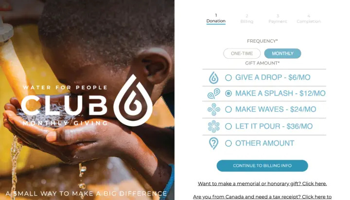
This donation form clearly defines each giving level with a different themed name and offers an easy option to choose between one-time and monthly gifts.
By optimizing your donation page, you can set your website up for success and begin generating an extremely beneficial giving cycle — converting more visitors into first-time donors, offering a positive user experience that encourages further engagement, and driving those donors towards forming long-term relationships with your mission.
The steps outlined in this crash course can easily be handled on your own, especially with the use of intuitive donation software and handy plugins and apps for your website builder. However, working with a technology consultant will likely be your best bet for deeper technical or strategic updates.
Regardless of the exact scale of your website’s improvements, the main takeaway is to take a strategic approach. Think about the user experience that your site currently offers visitors. Are there any hurdles or slowdowns in the donation process? Are you generating the most possible value from successful conversions? Start by answering these questions and you’ll be on your way to building a more effective donation page in no time. Best of luck!