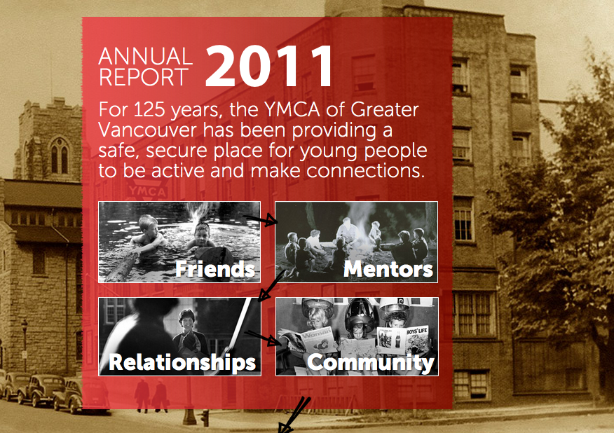
Much of the time nonprofit organizations spend way too much time, and money, making boring annual reports that few people actually read. Over the last few years more and more organizations have been using the annual report as a great storytelling vehicle and Katya Andresen recently highlighted one such annual report in her post titled “The best darn annual report I’ve seen this year”.
A friend of mine recently referred me to the YMCA Vancouver’s 2011 Annual Report and my first thought was “that is one bad ass annual report”. I’m not sure if those words have ever been spoken or not but that was my first though. Only later did I find out that it was the work of Domain 7 here in Vancouver and re: charity favourite Trevor Meier was heavily involved in the process.
Trevor sums up the aim of the annual report this way:
Our idea was to bring a traditional print piece to the web in a way that highlights the YMCA’s story. In the midst of facts and figures of the annual report, we wanted to bring a real YMCA story to life. Moving to the web made this once-a-year piece more widely accessible (and eliminated print waste), and using a narrative helped make it meaningful.
This annual report is not just a great example of incorporating story and visuals into an annual report to make it engaging it is also a tremendous case of what is possible with digital and the web. Things like navigation, sharing and scale are just not possible in this way with print. So without further ado, here is the
