
In today’s higher ed marketing landscape, a strong online presence is critical. These days, 95% of teens have access to a smartphone, with 46% saying they are online “almost constantly.” Connecting with current and potential students, families, and alumni online and on mobile devices is an increasingly important priority.
Your college website is one of the first places prospective students will look to learn more about your institution, the programs you offer, and how to apply.
However, not all websites look good on mobile phones. Developers need to consider design best practices and account for different screen sizes when creating a website. This guide will walk through the following topics to help you create a mobile-optimized college website:
- Why is mobile user experience important?
- Qualities to look for in a mobile-optimized college website
- 5 mobile-friendly college websites
College and university website design is becoming more accessible than ever before, and mobile-friendliness is a significant part of that movement. Your students will appreciate your efforts to make your website easier to navigate on all devices, leading to a more positive user experience.
Why is mobile user experience important?
In general, user experience is important because it ensures your audience can easily engage with your site. 88% of people are less likely to return to a website after a bad user experience. With the emergence of smartphones and other smart devices, your college should consider what your website and other online content will look like on these screens.
It’s not hard to see why. First, no one likes going on a website and having to pinch and zoom out just to look at the content or turn their phone sideways to view a web page. These issues are eliminated if you take the steps to mobile optimize your site.
Additionally, specific mobile-friendly qualities can also increase the accessibility of your college site. Web accessibility is especially crucial to ensure that you’re not turning away potential users due to ability, location, and device. In fact, not taking the steps to optimize your website for mobile use will likely cause you to miss out on potential opportunities and decrease site traffic.
Qualities to look for in a mobile-optimized college website
So, what does a great mobile-optimized website look like? Before we dive into our list of top college mobile sites, let’s review some of the top distinctions between a mobile and desktop site:
- Screen size: This is obvious, but it’s important to note: mobile screens are much smaller than desktop ones. If you try to view a website’s desktop version on a mobile device, the text is often too small and you’ll have to zoom and scroll to see the necessary information.
- Screen orientation: It’s more than likely that mobile users will primarily use their phones in portrait mode. 90% of mobile sites use vertical navigation while desktop versions are more likely to use horizontal navigation.
- Tappable vs. clickable functions: With a computer, your site visitors will likely be navigating with a mouse or trackpad. Hovering the cursor over a site element can also trigger actions. With mobile phones, navigating a website is done with a finger instead. Clicking on small links may be difficult and hovering isn’t really possible.
- Content prioritization: Because of the difference in size, you have less room to display content on a mobile site than on a desktop. Think hard about what you want to prioritize and ensure that is the focus when designing your mobile-friendly site.
- Integrations with phone functions: Have you ever seen a “call” button or “email” button on a site that, when clicked, will automatically make a call or open your email app? Integrating your website functions with already-existing phone features is a great way to improve mobile user experience and leverage the unique features of the device at hand.
Overall, remember to keep your mobile design simple, don’t overcrowd the website layout, use larger font sizes, prioritize portrait mobile view, and incorporate prominent buttons and links.
Some website content management systems (CMS) will even have specific functionality to ensure that your web pages look great on mobile devices as well. You can use this free Google mobile-friendly tool and simply insert the URL you want to test for mobile optimization.
5 mobile-friendly college websites
We’ve written about Kanopi’s favorite college websites before, reviewing 20 sites that we believe are innovative and focused on user experience. Using that list, we pulled five of them with exemplary mobile-friendly sites.
1. The University of British Columbia
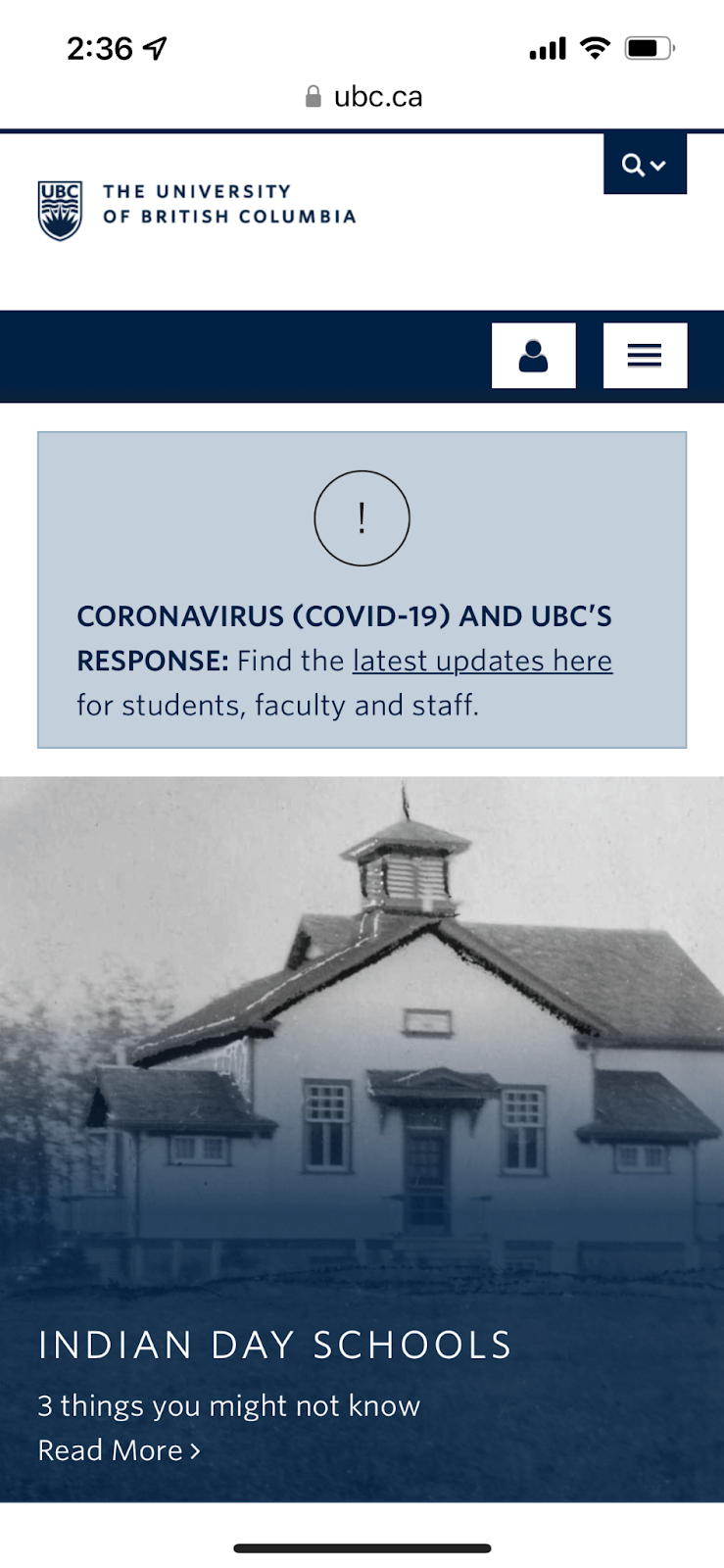
The University of British Columbia has a simple portrait mode mobile-friendly site. It’s easy to navigate, with a pop-down menu that you can tap with a single touch and explore their many online resources.
We love how easy it is to navigate, with the most important news feature and the latest updates at the very top of the homepage. This ensures that as soon as a user enters their mobile site, they are presented with the highest priority content.
Keep scrolling to encounter their social media connections. Instead of small links that are difficult to press with a finger, the University of British Columbia included graphic icons so that users can easily click through to connect further with the school.
2. UCSF’s Department of Pathology and Laboratory Medicine

Kanopi provided web design and development support to help UCSF’s Department of Pathology and Laboratory Medicine create a website that accurately reflected the excellence of its services. We even helped boost their online presence with a 26% increase in sessions per user, which you can learn more about in our case study.
We love their mobile site because of its easy-to-use vertical navigation that pops out from the side and can be closed with a simple tap. From there, the homepage presents the top three landing pages that target audiences are interested in. Explore their education programs, clinical services, and ground-breaking research all within the first couple of scrolls on the homepage.
When visitors click on any of the contact information available on the site, they’re sent directly to your phone’s email tool. This integration between the site and smartphone functionality is an added convenience leading to a simple user experience.
3. Cornell University
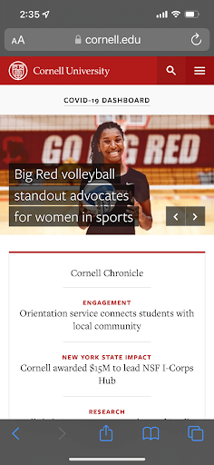
Cornell University is another well-designed and functional website for mobile user experience. At the top of their homepage, you can immediately click to access their menu or even tap on the search icon to look up the content you’re specifically looking for.
From there, with its easy-to-use vertical navigation, you have quick and accessible buttons to popular destinations like admissions information, important dates, and online events.
You can even scroll through different slideshows of compelling images, offering an engaging experience for mobile users.
4. The University of Notre Dame
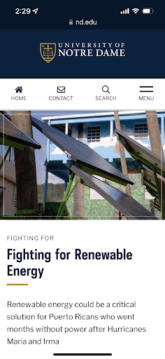
The University of Notre Dame’s website offers a straightforward navigation experience, with three useful buttons that lead to popular pages featured right at the top, alongside a pop-out menu providing more information. Scrolling down the homepage, visitors can access a variety of information on all aspects of the university. From research articles to campus life stories and events, the Notre Dame mobile website offers a convenient user experience for any visitor.
Plus, the site not only offers a streamlined mobile experience, but it also excels in accessibility, with vibrant, contrasting colors and descriptive link text for assistive technologies.
5. Kenyon College

Kenyon College’s minimalist website approach translates excellently to mobile devices. The site keeps its focus on an eye-catching homepage image and a bold quote to draw visitors in. Their main navigation menu is easily accessible at the top of the page. The menu offers a visually-interesting design that goes beyond the basic list to include a search tool and links for specific audience groups. \
Kenyon’s website also keeps the student experience front-and-center, further appealing to prospective new students.
Conclusion
Your college website should be doing all it can to connect with and engage your audience. From prospective students who want to join your community to alumni who still want to keep up with major accomplishments, your higher ed website users will genuinely appreciate the effort put into a mobile-friendly site. Keep in mind the qualities of an effective mobile website and use the five sites we mentioned as inspiration. Good luck!