
When done right, a nonprofit infographic can be a highly effective way to introduce people to a topic. When done wrong, however, infographics can obscure information, which can be damaging for a nonprofit’s reputation. I know I’ve seen examples of both.
Creating a nonprofit infographic the right way begins with a solid outline. This article will walk you through several possible ways to outline your infographic and the elements that will engage readers and spur them to take action.
Focus on a problem.
You’ve created your nonprofit for a reason: to solve a problem. Introduce readers to this problem in your nonprofit infographic and steps they can take to solve the problem. There are a couple of ways you can do this.
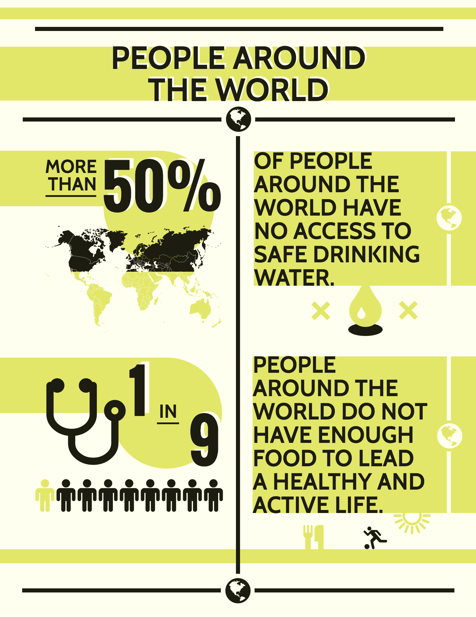
One is to visualize the problem using charts. If you have any data that is particularly shocking or compelling, that’s the data you want to use because it will grab readers’ attention.
Take this nonprofit infographic created by Venngage, which showcases some shocking statistics about world hunger.
You can also contrast data to highlight a problem. For example, if you want to point to a lack of resources in one part of the world, compare it with another part of the world that has more resources.
Or take this example from Bill Gate’s blog, which contrasts death caused by large predators with deaths caused mosquitoes.
![]()
An engaging (but controversial) approach is to challenge the reader’s beliefs. This approach can be controversial because it can make readers uncomfortable and force them to reflect on their own choices and actions, but it will also elicit an emotional response from them.
This nonprofit infographic by the Oregon Humane Society warns readers about the dangers of leaving your dogs in a hot car.

Focus on a solution.
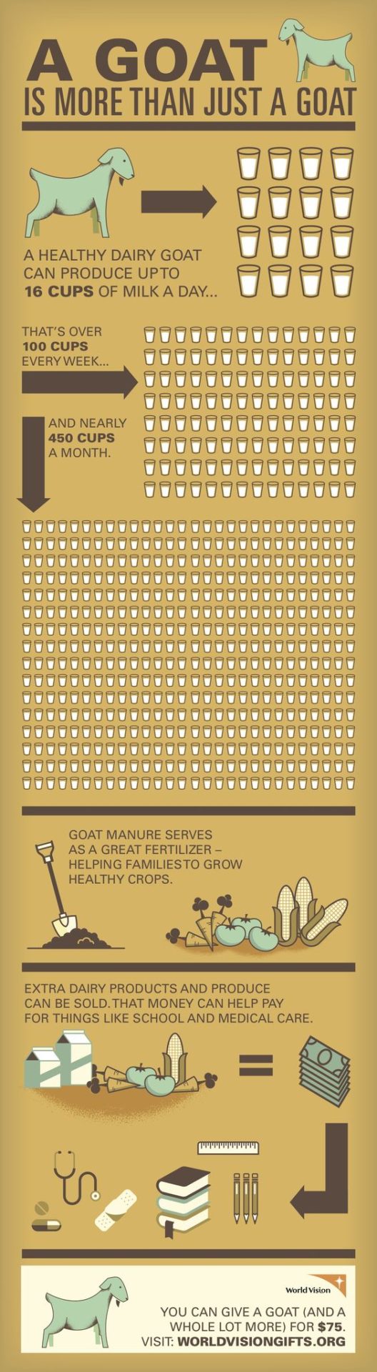
Another approach you can take is to highlight a solution to a problem that you outline. In this case, you would present the problem briefly and then focus your content on how the problem can be solved. Show readers how your nonprofit uniquely addresses the problem, to inspire readers to want to join in.
The below example by World Vision which shows how donations can positively impact a community.
Show the impact and success of your nonprofit.
This is an opportunity for you to showcase your nonprofit’s success stories. You want readers to know that they can trust your nonprofit to be ethical.
The nonprofit infographic annual report below shows the impact that donations and participation made for their cause.

2014 Annual Report DRAFT 020215
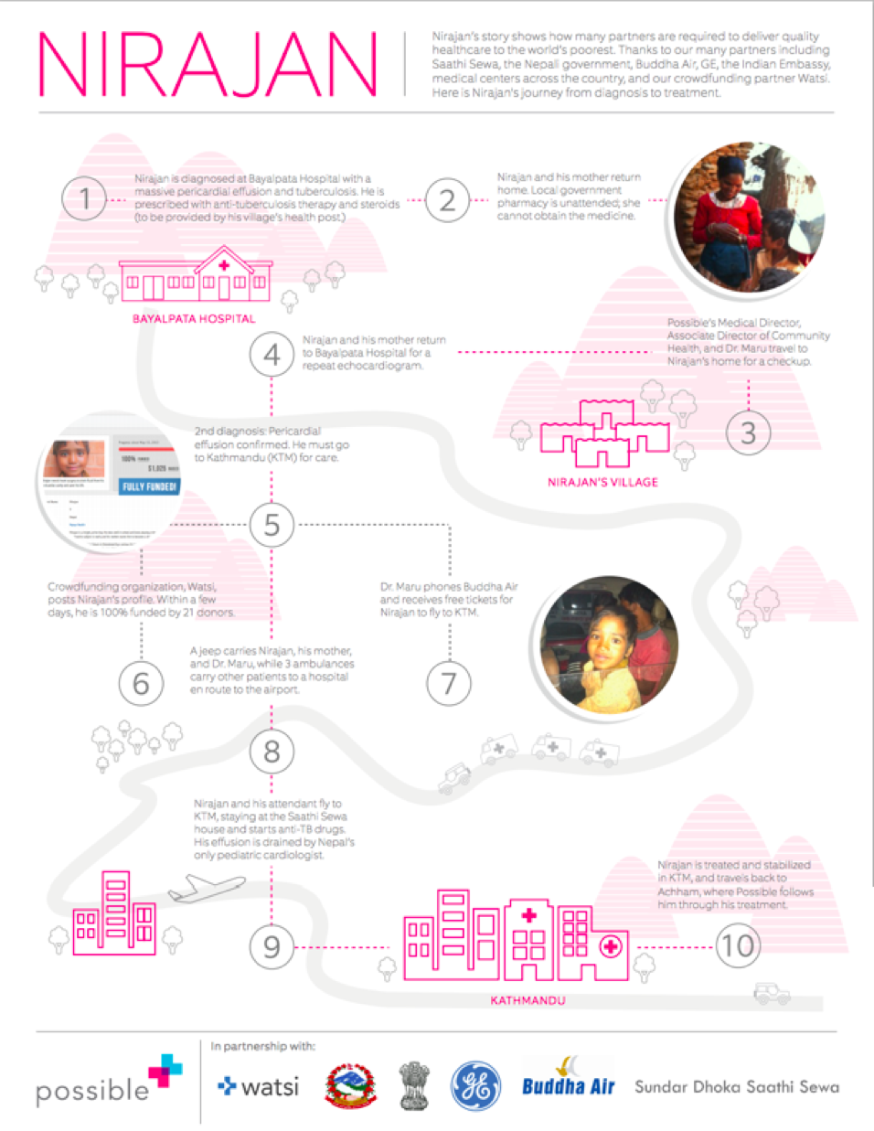
You can also tell personal stories to put individual faces to your cause and to appeal to the empathy of the reader. This will also provide a concrete example of how your nonprofit has made a difference for a specific person or community, which will be more compelling for readers who aren’t sure if they want to contribute.
The infographic below tells the story of Nirajan and his road to treatment of his illness with the help of Possible.
Focus on your campaign.
If your infographic is promoting a particular campaign your nonprofit is running, you will want to give readers all the necessary information needed for them to participate. This includes a description of what the campaign is about, how readers can participate, how they can donate, and how they can share the campaign with their networks. You can combine elements from the other layouts listed already–some compelling statistics, a personal story. Make it attention-grabbing and fun.
Include a call to action.
The first step is getting readers to care about the topic. The second step is getting them to act on what they read.
A solid CTA will give readers an actionable step that they can take. Of course, you will want to ask them for their email to add them to your mailing list in the body of the blog post along with your infographic. But there are some a couple of ways you can include CTAs in the actual infographic.
Social Media URLs
Definitely include your nonprofit’s Twitter handle, Facebook page, and, of course, the direct link to your nonprofit’s website.
Point to Further Information
The information in your nonprofit infographic is only the tip of the iceberg. Once you have introduced readers to a topic, the next step is to direct them where they can get more information. This will achieve two things: it encourages readers to learn more about your nonprofit and it makes the information on your infographic more credible by explicitly pointing to the source.
That’s another essential note: always source your information clearly!
Remember:
Nonprofit infographics are an effective tool for informing readers and inspiring them to take action. A well made infographic will provide readers with compelling and factual information and will point them to where they can learn more and pitch in. So make sure to include infographics in your next nonprofit marketing campaign!