Friction: Thousands of years ago it was used to start fires. Today, it’s killing your donation pages.
For real.
The deeper I dive into online fundraising optimization and the more I work in the world of digital fundraising, the more convinced I am that friction reduction is one of the easiest ways to increase online giving (I’ve seen it work first hand). Even with tool limitations, cost restrictions, and other hindrances, I know you can do a better job of reducing friction for donors which will lead to more money. And by the end of this post, I hope you’ll know that too, as well as how you can go about making improvements today!
Why People Donate (Or Take Any Action Online)
To understand why friction is such a big deal to you and your fundraising, you first need to understand why people choose to donate – or not (I need to give many many hat tips to NextAfter for the great thought and visuals used here).
People make a donation (or take any action online for that matter) when the value of making the donation is greater than the cost of that action. There is a ‘decision scale’ that is very delicately balanced is like this:
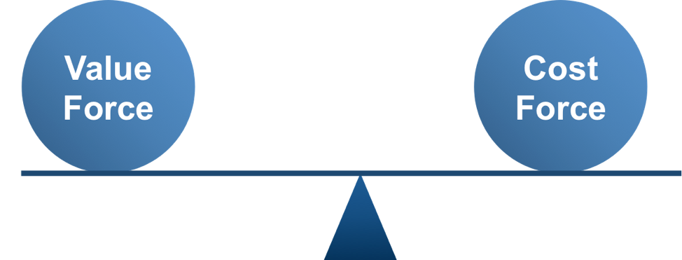
So your job as a marketer and fundraiser is to tip the scale in your favor on the value side. There are two ways to do this:
- Increase Value
- Reduce Cost
But to do that we need to better understand what factors go into creating value or cost. That’s where this nerdy equation comes in handy:
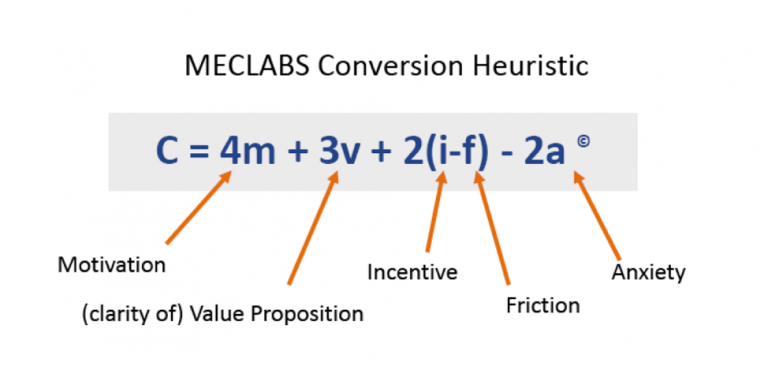
On the value side, motivation is the biggest driver of value, with a factor of 4. This taps into what people believe, what they value, what they care about. It can be hard to uncover and it’s not the same for everyone but is the biggest driver of donations or actions.
Then we have the clarity of the value proposition with a factor of 3. This is how you position your values and organization to connect with the potential donors’ and what motivates them. It’s connecting those ‘value dots’. This is also hard but gets a bit easier and NextAfter has some great research and practical tips on value proposition in this study/eBook.
Incentive – matching donations, perks, time urgency, etc. – rounds out the value factors and then we get into the cost factors. Friction and anxiety.
Anxiety comes out in questions like:
- Will my donation make a difference? How will I know?
- Is this page secure? How do I know?
- How will my information be used? How do I know?
The value proposition helps reduce some of this and great storytelling can also reduce some of this anxiety but there are easy/practical things like having ‘https://’ with a secure site and donation page, having a ‘lock’ or other symbol that shows the information is secure. A privacy policy, a confirmation email, and the 100% model are all things that help reduce anxiety here as well.
Now we come to friction. This is, generally speaking, the easiest part of the entire equation to fix and can instantly lead to results. Most organizations have a value prop, add some incentive, and reduce anxiety so the donation decision often comes down to this question:
Am I motivated enough to make a donation that I am willing to overcome this friction?
Here’s what that question looks like with the probability of conversion added in:

Here’s how Jeff Giddens from NextAfter explains this chart in a great post on motivation and friction here:
The vertical axis represents motivation and the horizontal axis represents friction.
The blue line represents the probability of conversion. Anything above and to the right of the line will convert. Anything below or to the left of the line will not convert, it will lead to abandonment.
The upper right-hand quadrant is what we must aim for. We want to send highly motivated people to our donation form, so they are motivated to give. We also want to introduce as little friction as possible so it makes it easy for them to give. If we do that, we’ve got a great, great opportunity to get people to convert. Now maybe it’s not 100 percent of the time, but if we send highly motivated people to low friction forms, the chances are very high that they are going to convert.
Makes sense right? The more motivated someone is to make a donation when they come to your site or donation page, the more friction they’ll put up with in order to do so. But here’s a sobering reality:
85% of people who visit your donation page and 99% of people who visit your website will NOT give to you
Yeah. Go make a cup of tea, eat some chocolate, or just curl up into a ball in the corner of the room and cry for a bit. I’ll wait.
Back? That sentence put another way just says that the average donation page converts 15% of visitors and the average website converts traffic to donations at about 1% (according to the M + R Benchmarks report and summarized here by eleventy). And there is HUGE opportunity to make some significant gains on those rates, and your rates, by reducing friction.
And even a small increase in conversion rate by reducing friction on your donate page means real money and real donors! Here’s what I mean:
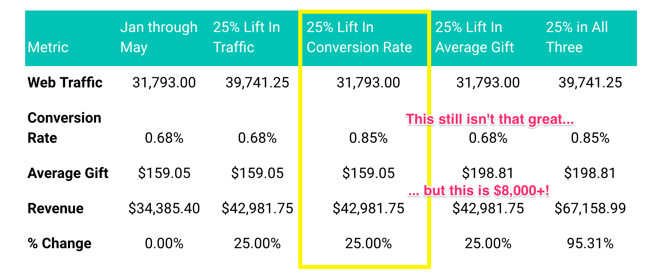
This was a chart we put together for a great client with a terrible donation page flow and system that was fraught with friction. To be fair, they knew it but were limited by their CRM/donation tool (which sucks) and we were trying to show the cost of NOT changing. In the above scenario, a slight increase in overall conversion rate – 25% or from 0.68% to 0.85% – would mean an additional 54 donations and over $8,000 in revenue in 5 months. Just by making the donation experience a little bit easier to navigate. Something that is 100% in your control.
And yes, it is 100% in your control. If you have a crappy tool then change it. But it integrates with your CRM and saves finance and IT time and makes their lives easier you say? How about raising more money for your mission and making your donors’ lives easier? Isn’t that more important? There’s a whole rant here but I’ll save it for another day…
Okay…
By now, hopefully, you have an understanding of why donors make donations (value is greater than cost), what factors go into creating value and reducing cost, how motivation and friction are linked for your donation page, and that there is great potential ROI by simply reducing the friction on your donation page.
So with that in mind, here are the…
7 Types of Donation Page Friction
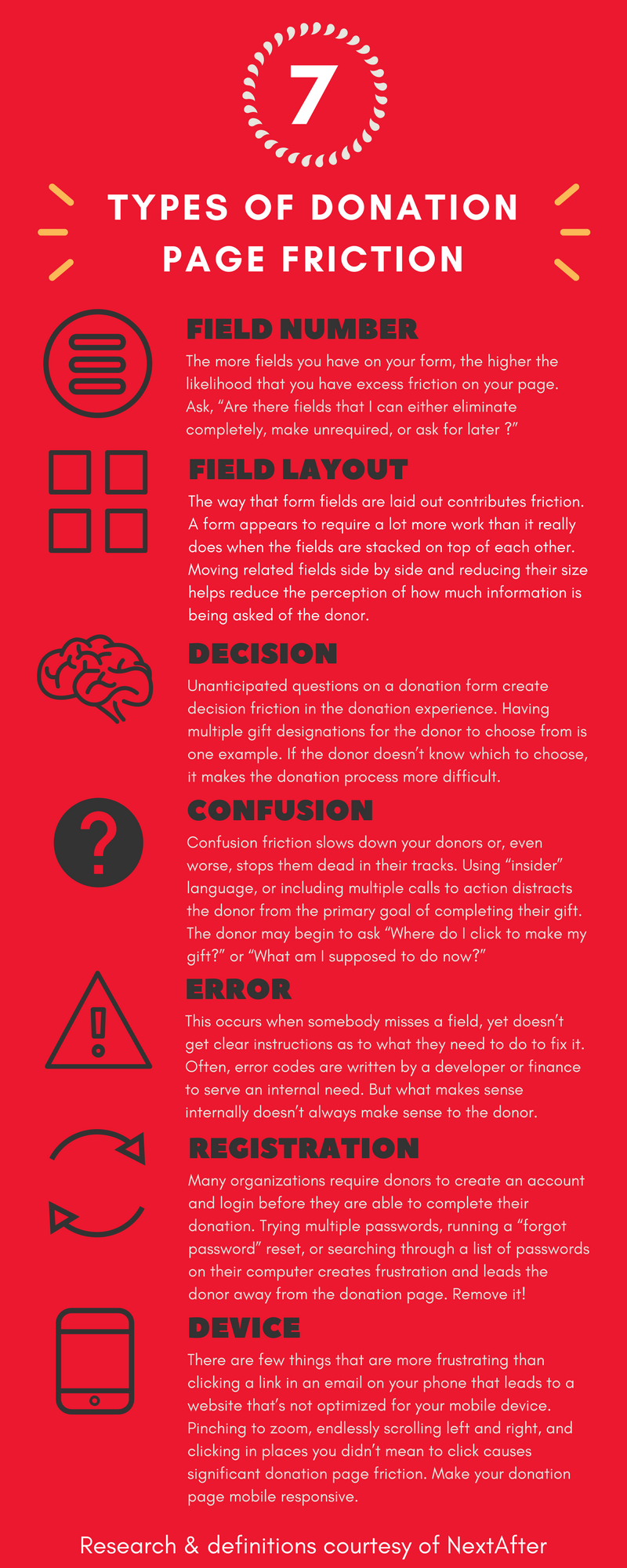
From what I’ve seen, much of the friction in a nonprofit’s donation page comes from the tool or product they’ve chosen (yes chosen) to use for or on their donation page. It may not allow you to change the field layout, require registration, control what messages get displayed when errors come up, or even be mobile responsive (which is crazy nowadays!). So a key question you should be asking yourself:
Is my donation tool/product causing unnecessary friction for our donors causing us to lose revenue and donations every single day?
If the answer is yes or even maybe, you should start looking at other solutions ASAP. Would you send out a direct mail appeal with an incredibly hard to read, understand, and fill out reply device? No because that would be a waste of money. So why do you let that happen on your website where any donor can give (almost) any amount at any time? It’s crazy.
Before you look into purchasing a separate online donation tool, why not look to your nonprofit CRM first? They often come with tools to help you create donation and event registration pages. If you need something more robust, you can always look into other donation tools that integrate with your CRM later.
Okay, tool restrictions aside, that leaves Field Number, Decision, and Confusion, friction more in your direct control today.
Reduce Field Number Friction
This is a pretty easy one to solve… have fewer fields! The biggest debate is generally around phone number. If you are really going to use their phone number is a beneficial way (for your donors) then you consider having it, but proceed with caution. Adding just that one extra field can reduce donations by over 40%! People get anxious (a cost factor in that value equation) when you ask for their phone number. They don’t know how it will be used, they don’t want to be called at night, and they don’t want to get solicited. So all things being equal, leave it off.
Reduce Decision Friction
Donors don’t know what your gift designations are. They don’t know the difference between a Gold Circle gift compared to an Annual Fund gift. Even asking for the donation to be recurring can cause decision friction especially when there are too many options (recur on the 1st, 15th, other, through your bank account, credit card, etc.). Inspire people to make a donation that will make a difference, then get the hell out of their way!
Reduce Confusion Friction
This often happens when you have a donate page that is also serving as an ‘other ways to give’ page. When someone clicks Donate or Donate Now they want to make a donation. Putting them on a page that then has 8 other ways to give with emails, phone numbers, and different buttons leading to different pages is very confusing. You should absolutely provide information on how donors can give via phone, bequest, stock, etc. but it shouldn’t be front and center on that donate page (if on there at all).
A Great Example
If you want a fantastic example of reducing friction with little to no field, decision, and confusion friction, check out ugm.ca/donate.
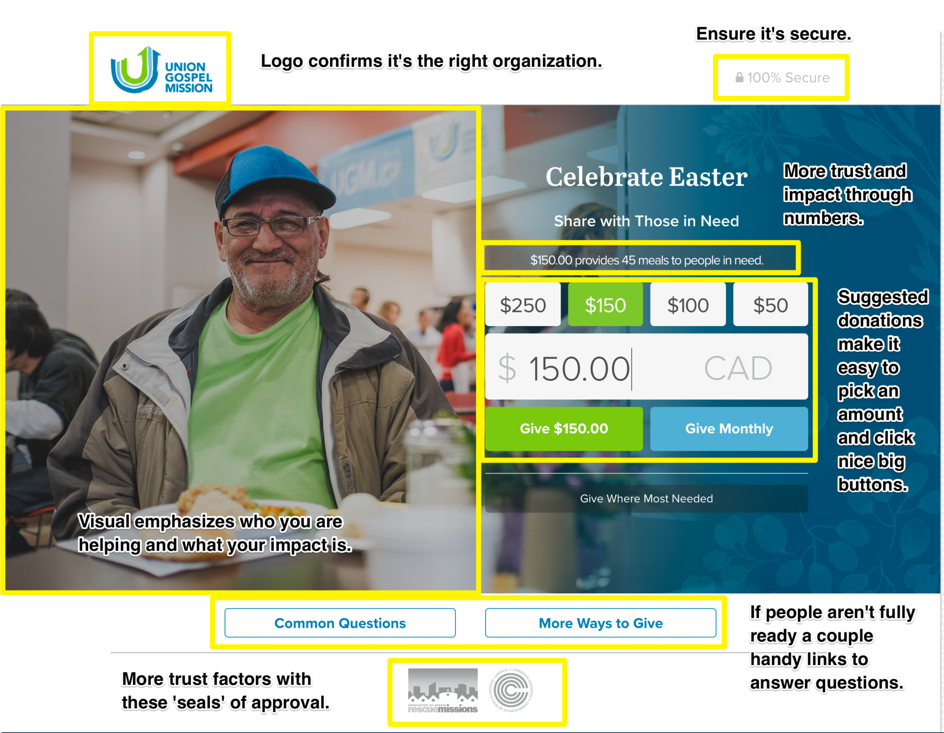
I don’t think the value proposition here is super clear and I’d rather have the Common Questions and More Ways to Give expand to with content to keep people on the page, but overall this is a great first page in making it easy for someone who clicked donate to continue along that journey.
Then you get to their beautiful, beautiful form.

Very clean, simple, and elegant. I don’t like the ‘what inspired your gift today’ question here as I don’t think it’s a useful data point for the organization and many donors may not even know or want to answer but the layout is minimal and beautiful. But ‘where is their address’ you may be asking yourself. Aha… it appears once you start filling in your name!
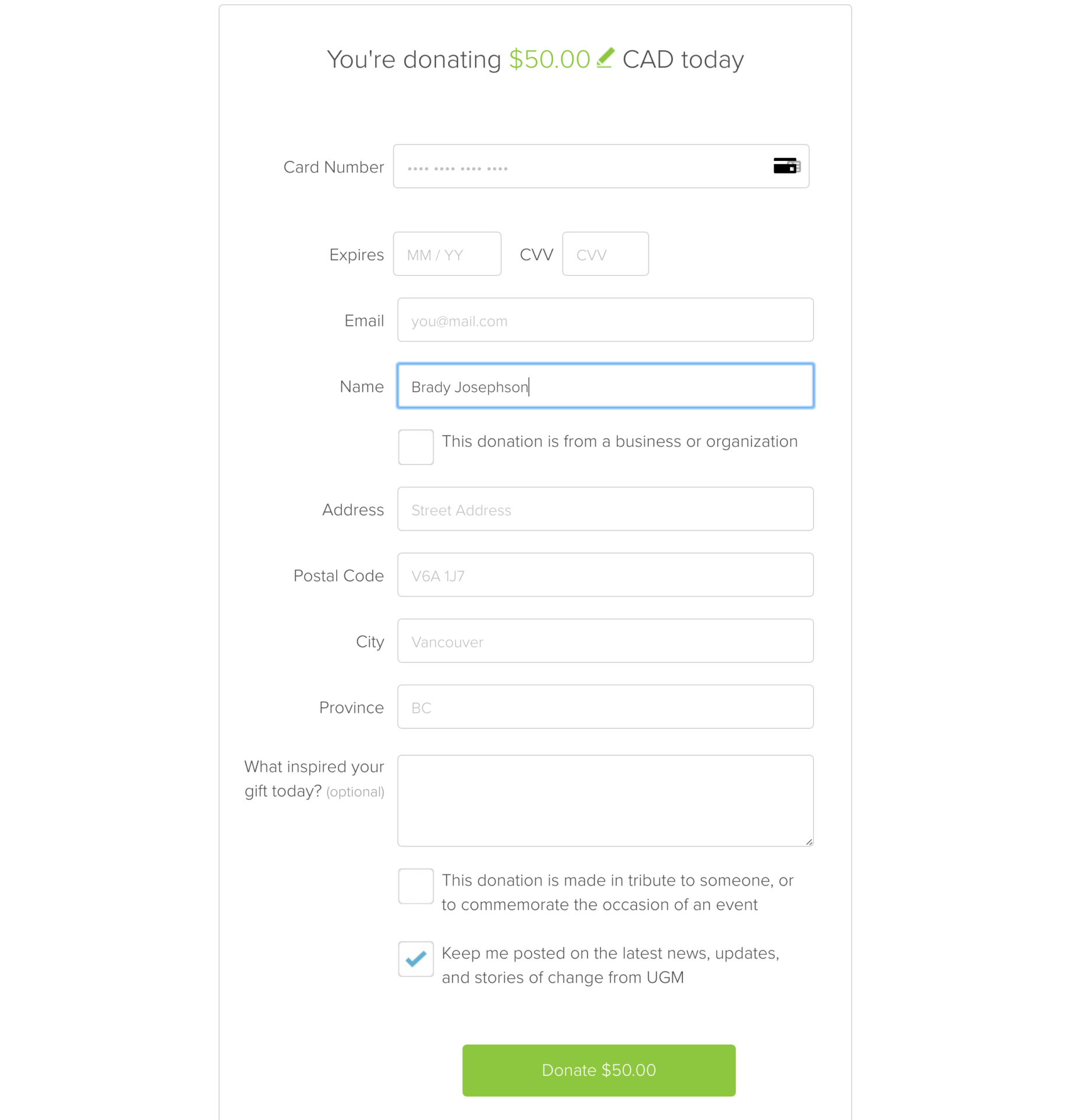
That’s next level but by keeping the form short – in appearance – it’s less daunting, seems less ‘friction-y’ and once you start filling it out the additional fields aren’t really going to stop you (plus they are common, required fields for online transactions).
So…
Do you have unnecessary friction on your donation pages? If so, it’s costing you money and donors. But it’s pretty simple to fix by getting a better tool or at least finding ways to reduce field number, decision, and confusion friction. This can help lower the friction level which means you’ll need a lower motivation level from visitors for the value equation to tip in your favour which leads to real money and real donors. Good luck!
Want More?
- Motivation vs. friction on your donation forms
- NextAfter Friction Self-Assessment
- Conversion Rate Optimization: Three Strategies